
Finland’s Frictionless Mindset Is a Blueprint for Building Better Products

Finland doesn’t just use digital services—it lives in them. Everyday tasks are designed to be handled quickly, clearly, and without much fuss, whether that means checking a public service portal, confirming an appointment, or managing a subscription on a phone. For founders, it’s a useful reminder that “convenience” isn’t a feature. It’s a baseline customers learn to expect.
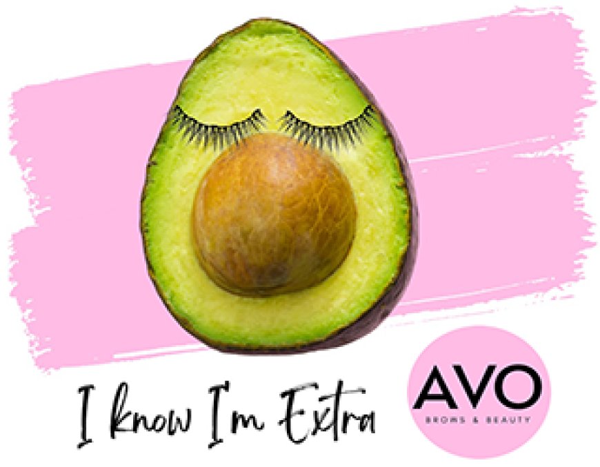
That baseline shapes online leisure, too. In Finland’s app-first routine, entertainment platforms sit in the same flow as travel, messaging, and shopping, and they’re judged with the same impatience for clutter and confusion. That’s why Finnish online casino NetBet fits naturally into the Finnish digital landscape: it’s one more mobile service category competing on speed, clarity, and ease of use in a country where online experiences are expected to feel tidy and dependable.
The Finnish advantage isn’t hype, it’s habit
Finland’s digital reputation isn’t built on a single breakthrough app. It comes from consistency and broad participation. The European Commission has repeatedly highlighted Finland’s strong performance in digital public services and citizen digital skills.
The EU’s 2024 Digital Decade country report adds a telling detail: 78% of the Finnish population say digitalization of daily public and private services makes life easier. That kind of sentiment matters because it signals something deeper than adoption. It signals comfort—and comfort changes what people tolerate. In markets like this, users don’t “give a new platform a chance.” They bounce.
For entrepreneurs, the lesson is straightforward: if your product requires patience to understand, it’s already losing.
The simplest products win more often than the cleverest ones
Founders tend to overvalue novelty and undervalue flow. But in a high-expectation environment, the winning edge is frequently:
- fewer steps, not more options
- labels that match what happens next
- pages that load quickly and consistently
- account controls that are easy to find
It’s not glamorous, but it’s scalable.
Mobile-first is a behavior, not a screen size
Plenty of companies say “mobile-first” and mean the UI doesn’t break on a phone. Finland shows why that definition is too shallow. Mobile-first is a behavioral reality: short sessions, quick decisions, and frequent context switching.
Finland’s transport and communications regulator Traficom has pointed out that internet use in Finland relies on mobile networks more than in other Nordic countries, and Finnish mobile data use has been exceptionally high in per-inhabitant terms. That kind of pattern shapes product expectations. When customers live on mobile connections, they become ruthless about responsiveness, readability, and friction.
What founders should borrow from that reality
If you want to build for mobile behavior (not just mobile layouts), design around:
- “one-thumb” navigation patterns
- short bursts of attention
- instant confirmation and clear status updates
- fewer dead ends and fewer “try again later” moments
This is the same logic that makes a food delivery app feel trustworthy. It’s also the logic that makes any online service—leisure included—feel credible.
Why identity and access design influence everything else
Finland is also a strong example of how a shared “access layer” can shape expectations. Suomi.fi e-Identification is described as a strong identification service that enables people to log into Finnish public administration e-services. Finland’s Digital and Population Data Services Agency describes Suomi.fi e-Identification as a joint identification service that customer organizations can use to identify end-users in their own digital services.
Even if a visitor never uses these tools directly, the culture they create is visible: people expect logins to be clean, consistent, and predictable. They expect “who am I logged in as?” to be obvious. They expect account journeys to be understandable.
In founder terms, it’s a reminder that onboarding isn’t just onboarding. It’s a credibility moment. If the first five minutes feel confusing, the next fifty won’t happen.
The U.S. parallel is already here
This isn’t just a Nordic story. The U.S. is also a smartphone-dominant environment, and entrepreneurs are building for the same behavioral constraints—fast decisions, short sessions, constant multitasking.
Pew Research Center reports that 98% of Americans own a cellphone of some kind and 91% own a smartphone. That’s not a tech stat; it’s a product reality. A huge share of your customers will meet your business through a small screen, mid-scroll, while doing something else.
That’s why Finland is such a useful lens for American founders: it shows what happens when a population becomes fully comfortable living online. The bar rises. Sloppy products feel outdated. Clear products feel premium—even when they’re simple.
The founder takeaway is operational, not philosophical
If you want to translate Finland’s digital advantage into something usable for a startup team, don’t start with big abstractions. Start with a few concrete standards:
Build for clarity under distraction
Most users are not sitting down to “use your platform.” They’re checking it quickly. Remove anything that makes them re-read a sentence twice.
Treat navigation as trust
A confusing menu is not just a UX issue. It signals disorganization, which makes customers hesitate.
Make the “basics” your differentiator
In crowded categories, your edge is often the experience people don’t have to think about.
And if you need a neutral, authoritative benchmark for how Americans actually use mobile devices, Pew mobile facts is a clean reference point for product planning and audience assumptions.
The post Finland’s Frictionless Mindset Is a Blueprint for Building Better Products appeared first on Entrepreneurship Life.